
Guide

Comic Book Cover Ideas: 40 Cover Layouts by Genre

This guide is for designing your own cover, not a gallery of famous comic book covers. You get the parts of a cover, 40 layout ideas sorted by genre, eight original example covers, two fixes for the most common mistakes and a checklist for print.

Updated 12 min read

Anatomy

The parts of a comic book cover

Good comic cover design starts with knowing the pieces. A monthly issue, a collected trade and a manga volume carry the same pieces in different places. Switch between them, then tap a number to see where each part sits and what it is for. Conventions vary by publisher and era, so treat this as the common pattern, not a rule.

12345678
The classic monthly layout: logo across the top, small information in the upper left, barcode low in a corner.
  1. Sources: cover anatomy is described in design writing on monthly comics; barcodes became standard on newsstand comics in the mid 1970s. Your own book needs only the parts that help a reader: a self published one shot can skip price and corner box.

40 ideas

40 comic book cover ideas by genre

Eight genres, five compositions each. The red bar in every wireframe is where the title goes. Every cover layout here travels between genres, so a face off from the superhero tab can work for a romance rivalry too. Some names are our own labels for common cover types.

Big shapes, saturated color and a hero you could recognise by silhouette alone.

Ideas 1 to 5 of 40

  • 1

    Iconic pin up

    Use it when a first issue or a new hero who needs to be known by shape alone.

    Title: across the top, with the head just below the logo's bottom edge.

    Watch out: a cool pose with nothing else says superhero but not your story. Add one prop or a hint of setting.

  • 2

    Low angle power shot

    Use it when the hero should feel huge, or a threat towers over the city.

    Title: in the sky the low angle opens up at the top.

    Watch out: extreme foreshortening breaks hands and feet. Check the pose at thumbnail size.

  • 3

    Face off

    Use it when the issue is about a rival, a betrayal or a big fight.

    Title: a band across the top, both heads below it.

    Watch out: two equal figures split the eye. Make one bigger or closer to the reader.

  • 4

    Team lineup

    Use it when a team launches or a new member joins.

    Title: top, with the lineup in the lower two thirds.

    Watch out: more than five faces turns into noise from across a room. Overlap them or cut some.

  • 5

    The empty emblem

    Use it when the hero is missing, retired or presumed gone.

    Title: top, emblem centered below it with plenty of air.

    Watch out: on issue one nobody knows the emblem yet, so it reads as a random shape.

Wireframes show composition only. The red bar is the title; small boxes such as the issue number are left out to keep the thumbnails readable. To match the art to the genre, browse comic art styles.

Examples

Eight original covers, one per genre

Each artwork was made for this guide with no lettering in it and a calm top quarter. The title, cover line and credits are live type laid on top, in a look that signals the genre, which is half of good comic cover design. Switch to Art only to see the space each one leaves for the title. The titles are invented for this page.

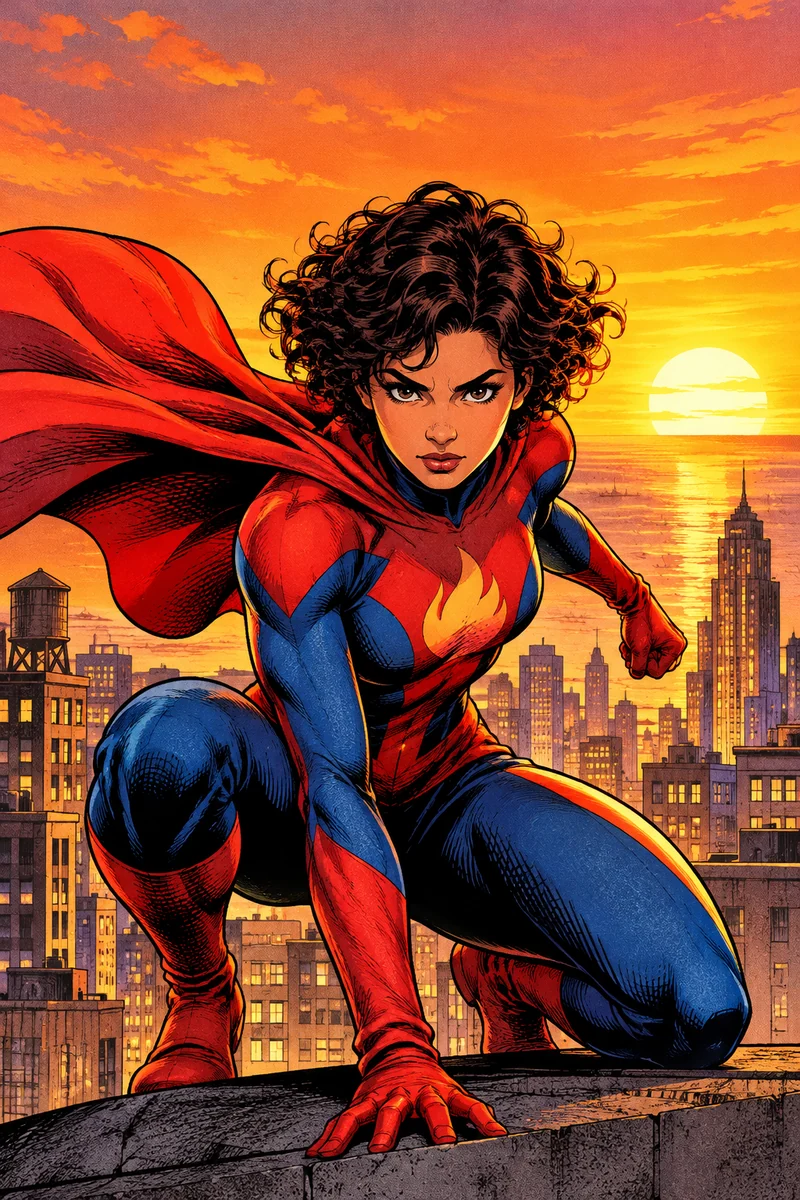
  • Original superhero cover art: a caped hero in a red and blue suit landing on a rooftop at sunset, open sky above
    No. 1

    Ember Signal

    Story and art by Rae Okoro

    The city has a new guardian

    Superhero

    Heavy display type with a dark outline, tilted a few degrees for energy. Issue box upper left.

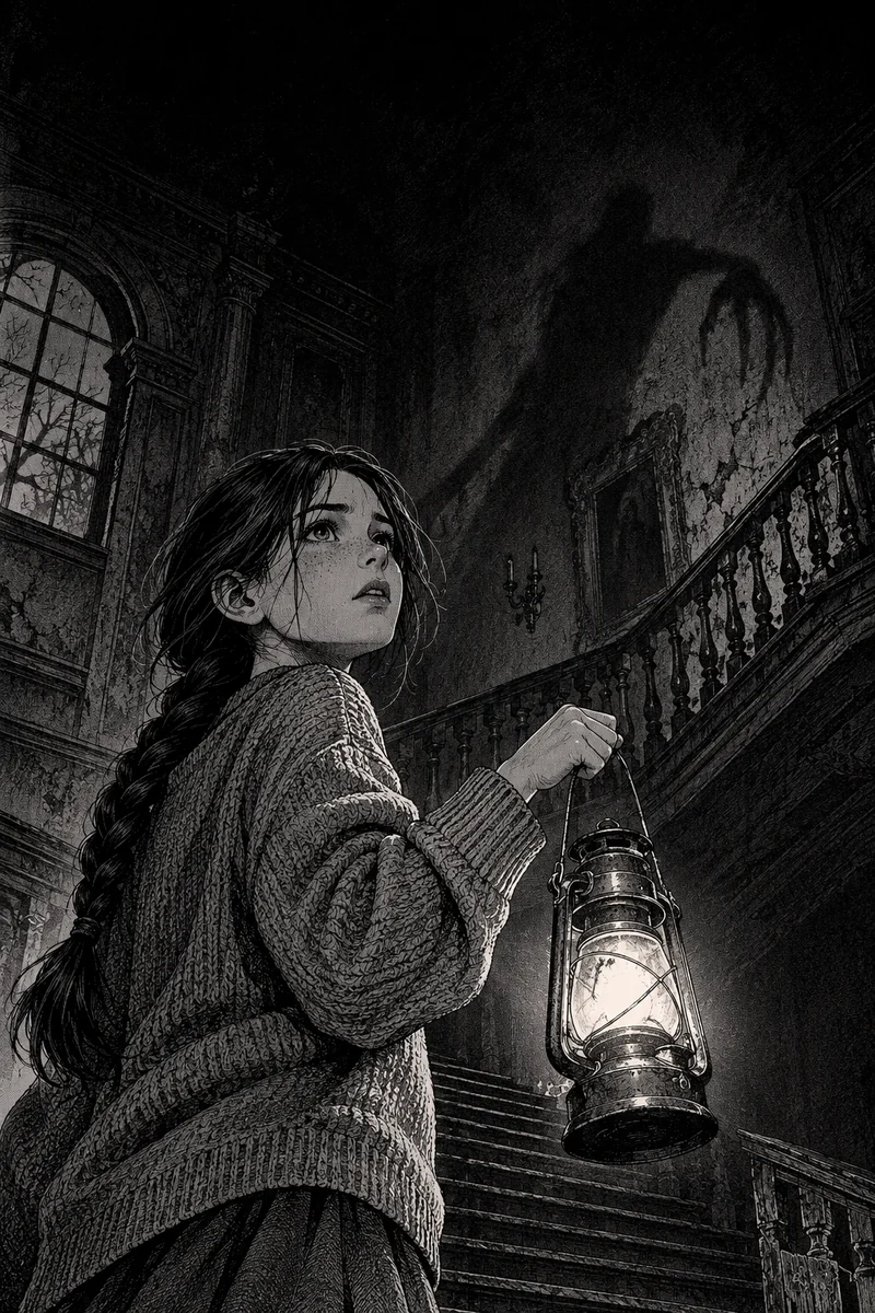
  • Original horror cover art: a girl holding a lantern at the foot of a dark staircase, a tall shadow above her

    A tale in four nights

    The Hollow Lantern

    Do not follow the light

    Horror

    Spaced serif capitals with a red glow, on a darkened top band.

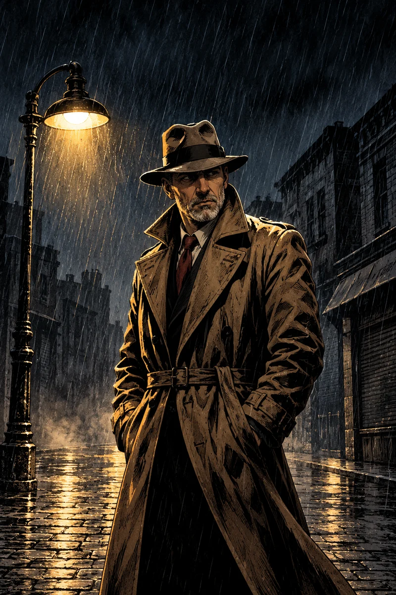
  • Original noir cover art: a detective in a trench coat under a streetlight on a wet street at night

    Rain on Ninth Street

    A case nobody wanted

    M. Calder

    Noir crime

    Italic serif, left aligned like a film title card, one thin rule.

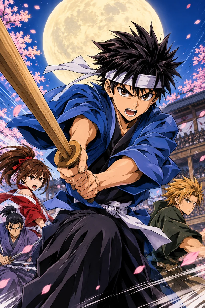
  • Original manga cover art: a young swordsman with spiky hair mid leap, speed lines behind him

    Paper Moon Rider

    The tournament begins

    VOL. 1

    Haru Senna

    Manga

    Heavy sans title in a white block, vertical volume tag near the edge.

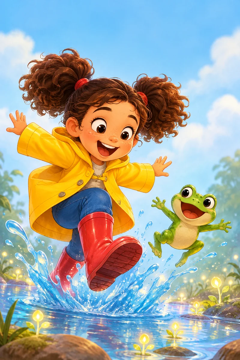
  • Original children's cover art: a girl in a yellow raincoat and a small frog splashing in a puddle

    Pip and the Puddle Planet

    A splashy adventure

    by Lou Bright

    Kids

    Rounded hand lettering in a yellow box with a hard shadow, like a sticker.

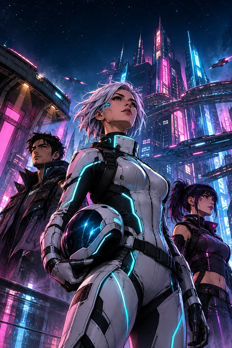
  • Original sci fi cover art: a pilot in a glowing suit looking up at a huge neon city at night

    ISSUE 09

    Orbit Nine

    Last stop before the dark

    Sci fi

    Wide spaced capitals with a cyan glow, a small mono issue tag.

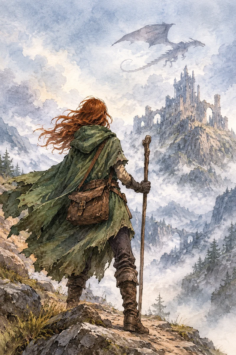
  • Original fantasy cover art: a cloaked traveler on a cliff path facing a distant castle and a dragon in the clouds

    Book one

    The Ash Crown

    Ilsa Varn

    Fantasy

    Gold small caps serif with a centered rule, like an old book.

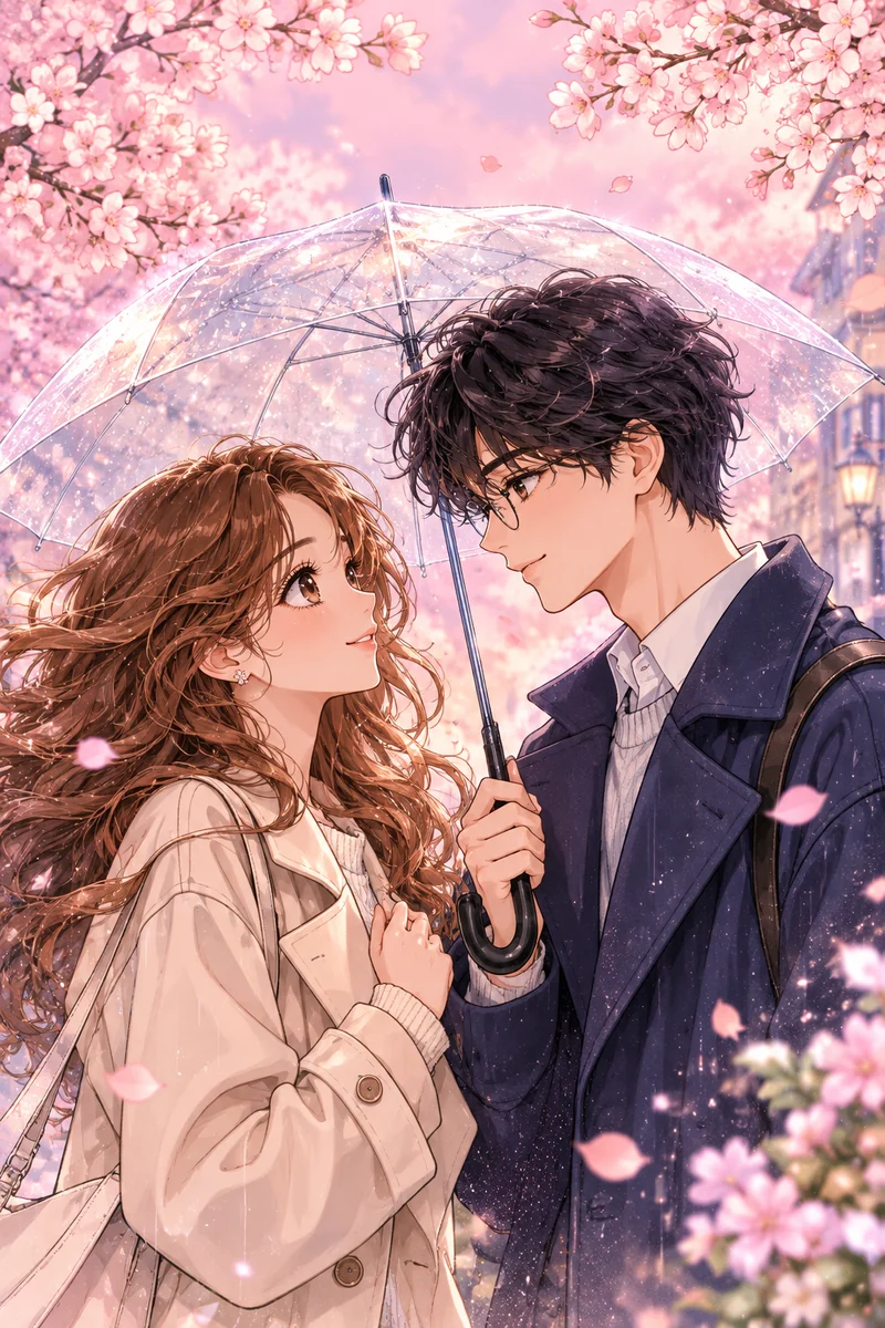
  • Original romance cover art: two young adults sharing an umbrella under falling cherry petals

    Letters to Juniper Lane

    Some words take a year to send

    June Ashby

    Romance

    Soft italic serif with a pink glow and handwritten cover line.

Cover art is made with our cover generator rules: art only, a calm top quarter, a quiet lower right corner. AI images often garble letters, which is why the type is added afterwards. To choose the title and lettering faces, see the guide to comic book fonts.

Fixes

Two cover design mistakes, fixed on the same art

Each pair uses the same artwork. Only the type changes, which is the point: most weak comic book covers have a cover layout problem, not an art problem.

Cluttered versus focused

Before
The superhero cover art used twice to compare layouts
Event banner, three bursts, stacked cover lines and a giant name plate. The hero is left with a strip of the cover.

After

The superhero cover art used twice to compare layouts
One logo, one tag, one cover line. The hero gets the cover back.
  • Keep one cover line. If you need two, the cover is trying to sell two stories.
  • Drop bursts and banners. They signal a sale, not a story.
  • Credits go small and consistent. A name plate bigger than the logo pulls the eye to the wrong place.

Title over the face versus clear space

Before

The sci fi cover art used twice to compare title placement
The title band drops across the middle, right over the character.

After

The sci fi cover art used twice to compare title placement
The title sits in the calm top quarter the art was made to leave empty.
  • Decide where the title goes before the art. Our cover art is generated with the top quarter kept simple for this reason.
  • If the art is already finished, move or scale the title, never the face: a cover reader looks at eyes first.
  • Check at thumbnail size. If you cannot read the title on a phone screen, nobody will in a store listing.

Clutter and logo clashes are the failures cover artists and critics name most often in their essays on cover design.

Comic book cover FAQ

Your cover starts with the story

Write the comic, draw the pages, then build the cover from a template with your own title on top.

Start a comic
VisaMastercardAmerican ExpressPayPal